Key visual and Cover

Key visual and Cover are strong ways of visual communication. Single images grab attention immediately and are easily understood.

Key visual

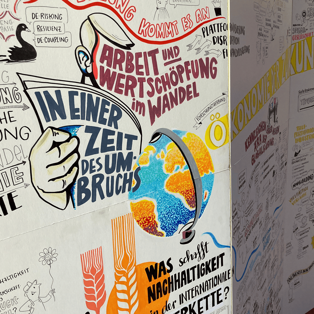
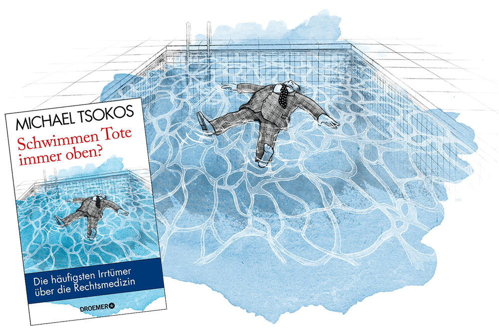
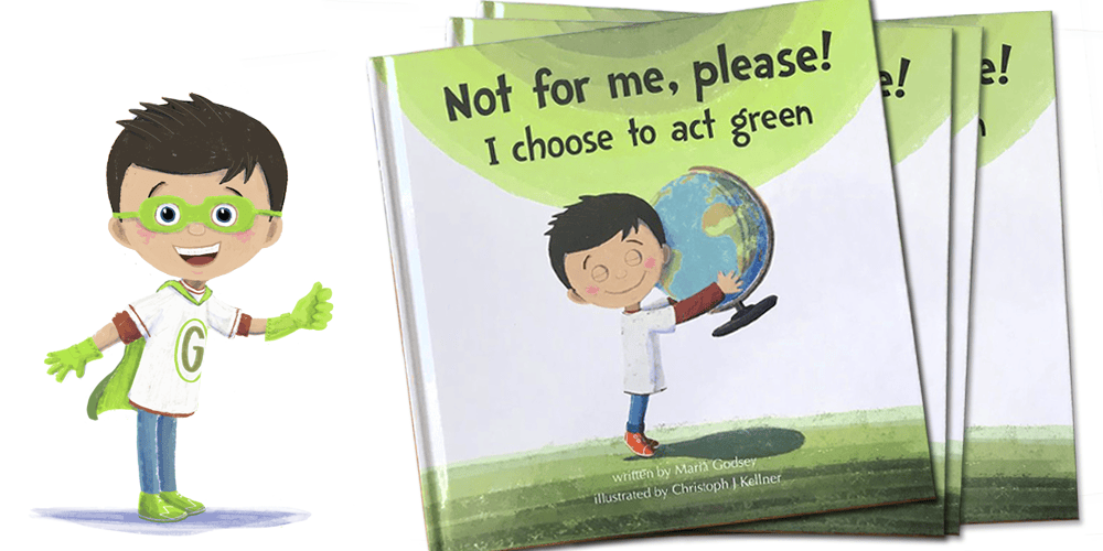
A key visual is a visual element that represents a central message, concept, idea, or identity. They are often used in marketing, advertising, design, and communication to create a concise visual representation of a specific theme or brand. Key visuals capture the essence of an idea or message and make it understandable at a glance. They can take the form of images, illustrations, symbols, or logos and serve to establish a strong visual connection, They pique the viewer’s interest. Key visuals are often consistently used across different media and communication channels to convey a clear and unified message.

In my preparation for graphic recording, I often use a key visual. This helps me engage with the topic and warm up my drawing skills. Frequently, the event’s title or theme is intertwined with it, creating an expressive unity.

Key Visual Example Graphic Recording Image Message Illustration studio animanova

Advertising Poster

In poster illustration, keyvisuals are used prominently alongside clear typography in large formats. Poster illustrations play a crucial role in capturing the viewer’s attention, conveying messages, and evoking emotions. Posters are often used in advertising to visually promote products, events, or services. They can be utilized in print media, outdoor advertising, or digital advertising campaigns. Illustrated advertising posters are still a prominent feature of any urban landscape – whether it’s advertising campaigns, movie screenings, or party promotions; they can be found on train platforms, inside trains, on billboards, and construction fences.

Cover illustration Do dead people always swim on top? studio animanova
Cover children's book environmental protection studio animanova

Cover for Book, Magazine and Album

Today, the artwork on the cover of a book is as integral as the written word itself. In addition to photographic imagery, illustrations are increasingly being used. Ever since there have been “illustrated” publications, their covers have also been designed. The New Yorker magazine is perhaps the most famous example that exclusively features illustrated covers. In the late 1930s, the practice of creating album covers began, and it was noticed that this significantly boosted sales. Thus, there were no longer any limits to album cover design, a trend that continued with CDs.

If I have the opportunity to illustrate a book, it’s only natural to also design the cover. The cover illustration is a crucial visual component of the book that communicates the mood, theme, or character of the publication. It provides the first impression and should be eye-catching, relevant, clear, and appealing to pique the potential reader’s interest and curiosity about the content. Readers want to get a sense of what to expect from the cover, and the illustration should be clear and easily understandable. Too many overloaded details can be confusing. A clear central motif (key visual) that conveys the message of the work is often more effective

Of course, the style of the illustration should match the mood and genre of the publication. Depending on whether it’s a children’s book, a fantasy story, a scientific report, or something else, my style may vary. I think about the emotions or impressions I want to evoke in viewers and design the illustration accordingly. Since a book is usually sold based on its cover, the art of design lies in the quality of memorability and originality. A good cover stays in memory. An original illustration that stands out from others will increase interest.